Process
Background/ Main Image
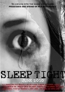
When choosing the image for my poster I new that I wanted to create a specific look. Using photoshop lightroom I totally changed the look of the face shot of the main character, changing the colour to grey scale and adding specific effect to the white of the eye in order for it to stand out. I also intensified the blackness around the eye, this also being so the eye would be stand out a great deal more.
I used a picture of a noose too, changing this also to black and white and increasing the saturation so the image had a unique look.
I then used Photoshop to create layers to combine both images, this adding eeriness and effectto the background. I had to play around for sometime with the layers as I had to get just right the combination of the two as if one image was to strong it would make the image less effective.
Below are the two images I manipulated into my final background.
Text
The text I used on my poster is conventional to that of a film poster. I used titles from our trailer as they worked well together with the picture, I also put the title of the film in whoch the poster is promoting and when it is going to be released. When doing research into film posters I was amde aware that every poster has some sort of information on it usually really small to show that the poster is a promotional device. Although not significant and hardly redeable I thought this was vital to include in order to make the poster realistic and conventional. The colour scheme I have gone for has been black, white and red. The reason lying behind this choice is the fact that our dream sequences were black and white in our trailer so I felt I would follow this through on to my other tasks, I thought red went well with the other writing as it symbolises anger and danger.
Below is an example I found of a similar poster to my own, it is set out in a conventional way, dark lighting is used to emphisise eeriness and it follows the same colour scheme as my own.


No comments:
Post a Comment