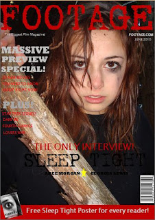
When constructing my front cover I used programmes such as Adobe in design and photoshop to create a project that was realistic to that of a other real film magazines. I manipulated the text as I wanted certain information to be eye catching. I also used my poster as I had done research into film magazine covers and alot of them were giving away free posters. I chose the name 'Footage' as I think it emphisises the fact that it is a film magazine. I feel my magazine front cover follows conventions, I made sure my masthead was a significant feature on the page as I want the audience to be able to identify with it quickly, this follows conventions. The fact I have a main image which takes up the page, with the character being central also follows conventions as they are promoting the main story of the magazine, the text which I have used in the middle of the page to compliment the image also is extremely conventional for a film magazine.
No comments:
Post a Comment